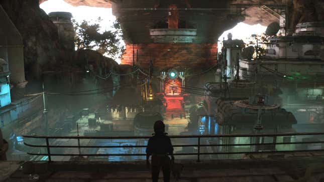
I was staring at a wall. It was an early mission in Ubisoft’s latest behemothic RPG, Star Wars Outlaws, in which I was charged with infiltrating an Empire base to recover some information from a computer, and this wall really caught my attention.
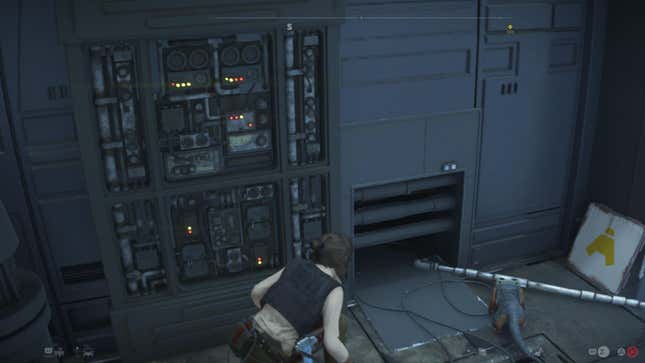
It was a perfect wall. It absolutely captured that late-70s sci-fi aesthetic of dark gray cladding broken up by utilitarian-gray panels covered in dull blinking lights, and I stopped to think about how much work must have gone into that wall. Looking elsewhere on the screen, I was then overwhelmed. This wall was the most bland thing in a vast hanger, where TIE Fighters hung from the ceiling, Stormtroopers wandered in groups below, and even the little white sign with the yellow arrow looked like it was a decade old, meticulously crafted to fit into this universe. I felt sheer astonishment at the achievement of this. Ubisoft, via multiple studios across the whole world, and the work of thousands of deeply talented people, had built this impossibly perfect area for one momentary scene that I was intended to run straight past.
Except I ran past it three times, because the AI kept fucking up and I was restarted at a checkpoint right before that gray wall over and over.
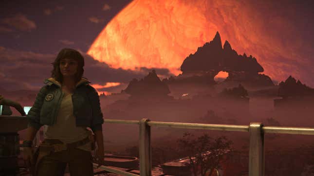
I’m struggling to capture the dissonance of this moment. This sense of absolute awe, almost unbelieving admiration that it’s even possible to build games at this scale and at this detail, slapped hard around the face by the bewilderingly bad decisions that take place within it all.
To be excited about a beautifully crafted wall is to set yourself up for an aneurysm when you start to notice the tiny, inflecting details on characters’ faces, or the scrupulous idle animations of a bored guard. Then as I tried to conceive that this same level of care was taking place across thousands of locations in multiple cities over a handful of planets, my genuine thought was: “It’s ridiculous that we mark these games on the same criteria as others.” How can someone look at this, this majesty, and say, “Hmmm, seven out of ten?” And then a guard sees me through a solid hillside and ruins fifteen minutes of painstaking stealth, and I wonder how it can be on sale at all.
In 2024, we have reached the most deeply peculiar place, where AAA games are feats that humanity would once have recognized as literal wonders, and yet play with the same irritating issues and tedious repetition as we saw in the 90s. This contrast, this dissonance, is absolutely fascinating.
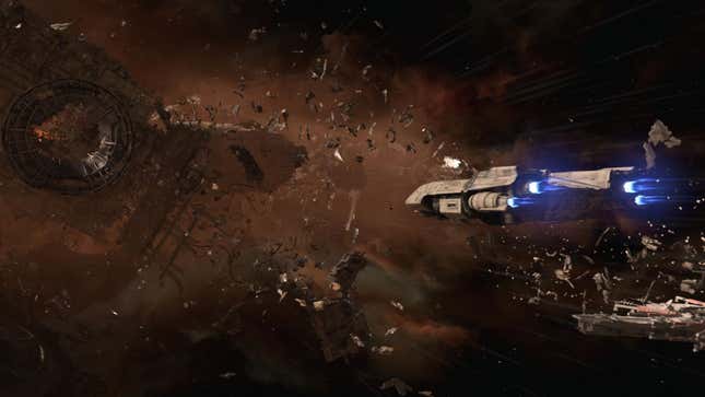
Ubisoft strikes me as the leader in this bizarre space. I have, for years, been delighted and bemused by what that company is capable of creating, albeit often not in positive ways. The Assassin’s Creed series routinely builds entire cities, even countries, in authentic detail, to the point where we almost take it for granted. It has always struck me as the most horrendous waste that a game like Assassin’s Creed Odyssey can recreate ancient Greece in such wonderful detail, and then gets thrown away, that entire digital space never used again for anything else. It could be given to the world, offered as a setting for a thousand indie games, reused and recycled as such an achievement deserves. Instead, it’s there for that single game, where we reasonably kvetch about the frustrating details of a broken quest, or at how crowd AI bugs out at crucial moments.
And this is only to touch on the art and architecture. We’re not even mentioning the fantastic writing, the exquisite voice acting, the sound effects, the musical score, the lighting, the concept art that makes such designs possible, and the direction and leadership that can bring all these disparate parts together. All as a backdrop to my repeating the run across the gantry because a distant AI decided to be triggered by a Nix it couldn’t possibly see, or because that time when I pressed Square it decided to throw a punch instead of trigger a takedown.
I’m old enough to remember a time when we’d lament that a beautifully drawn point-and-click adventure was no fun to play, and be so disappointed that such lovely artistic skill had been the backdrop for illogical puzzles and bad writing. Imagine the camera shot pulling out from that adventure game and revealing the room it’s in, the house that contains that room, the town that house is in, the city that town forms part of, and the country in which that city exists—that gets you close to the scale at which the same issue plagues us 40 years later.
Just that opening city in Outlaws, Mirogana, is more than gaming was capable of ten years ago, let alone 40. It, alone, would be enough for an entire game, with plots and missions and characters. And it’s a blip in this game’s mindblowing breadth. I cannot over-express the scale of what’s offered here, and how incongruous it feels that it can all feel so easily dismissed given such fundamental errors. Errors that mean the game attracts headlines like, “Star Wars Outlaws Is Too Simplistic For Its Own Good.” And I get it! I know what the article means! It’s right that its stealth is banal and badly implemented, and yet such a core element of the game. But God damn, why are we able to reasonably call this creation “simplistic”?
I’ve no idea what the solution can possibly be, but I feel it sits somewhere in a new order of priority. One that involves scaling back the ambition of everything that a large-scale developer knows it can achieve, and re-focuses resources on fixing the absolute basics that it so often cannot. Because the tragedy of a piece of art like Outlaws—or any number of other architectural masterpieces that we see come and go in this industry every month—being able to be sniffed at with a (deserved) 7/10, is too awful.
Read More: Star Wars Outlaws: The Kotaku Review
At Gamescom this year, I saw a talk (currently embargoed) about how wind will cause a game’s world to behave differently, and on one level it was incredible stuff, a technological marvel. But on another, it’s going to offer absolutely nothing if that game’s basic loops are dreary, or if the enemy AI is going to endlessly run into beautifully rendered walls. It could end up being a 7/10 game with technologically astounding wind.
And so I come back to that wall. And I thank everyone involved in making it so special, the artists who spent so long ensuring it felt authentic, and the level designers who placed it, and the people responsible for collision detection who ensured I couldn’t walk through it, and the people who coded the Snowdrop engine so it could exist at all, and the producers who encouraged the developers who implemented it, and every single person who was in some way responsible for making me that wall to momentarily stare at. And I wish I hadn’t had to sneak past it quite so many times.
.

